Anne Thomas
A refined legal identity designed to communicate trust, professionalism, and stability.
- Industry: Legal Services
- 2018
- My Role: Branding · Logo Design · Web Design Concepts
- Sketch · Adobe Illustrator · Photoshop
A refined legal identity designed to communicate trust, professionalism, and stability.
Anne Thomas is a family lawyer who required a professional visual identity that reflected the trust and reliability central to her practice. The project included logo design and initial website concepts aimed at creating a modern and approachable legal brand.
The challenge was developing a mark that felt both elegant and authoritative while remaining personal and memorable. Although the website project did not progress beyond concept stage, the branding itself became a strong and meaningful piece of design work.
The approach focused on simplicity, symbolism, and timeless visual structure to create a confident legal identity.
The logo was built around the letter “T”, transforming it into a pillar-inspired symbol representing stability, support, and professionalism. This subtle visual metaphor connected directly to both Anne’s surname and the dependable nature of family law services.
Clean typography and a restrained colour palette helped reinforce a calm, trustworthy, and premium aesthetic suited to the legal industry.


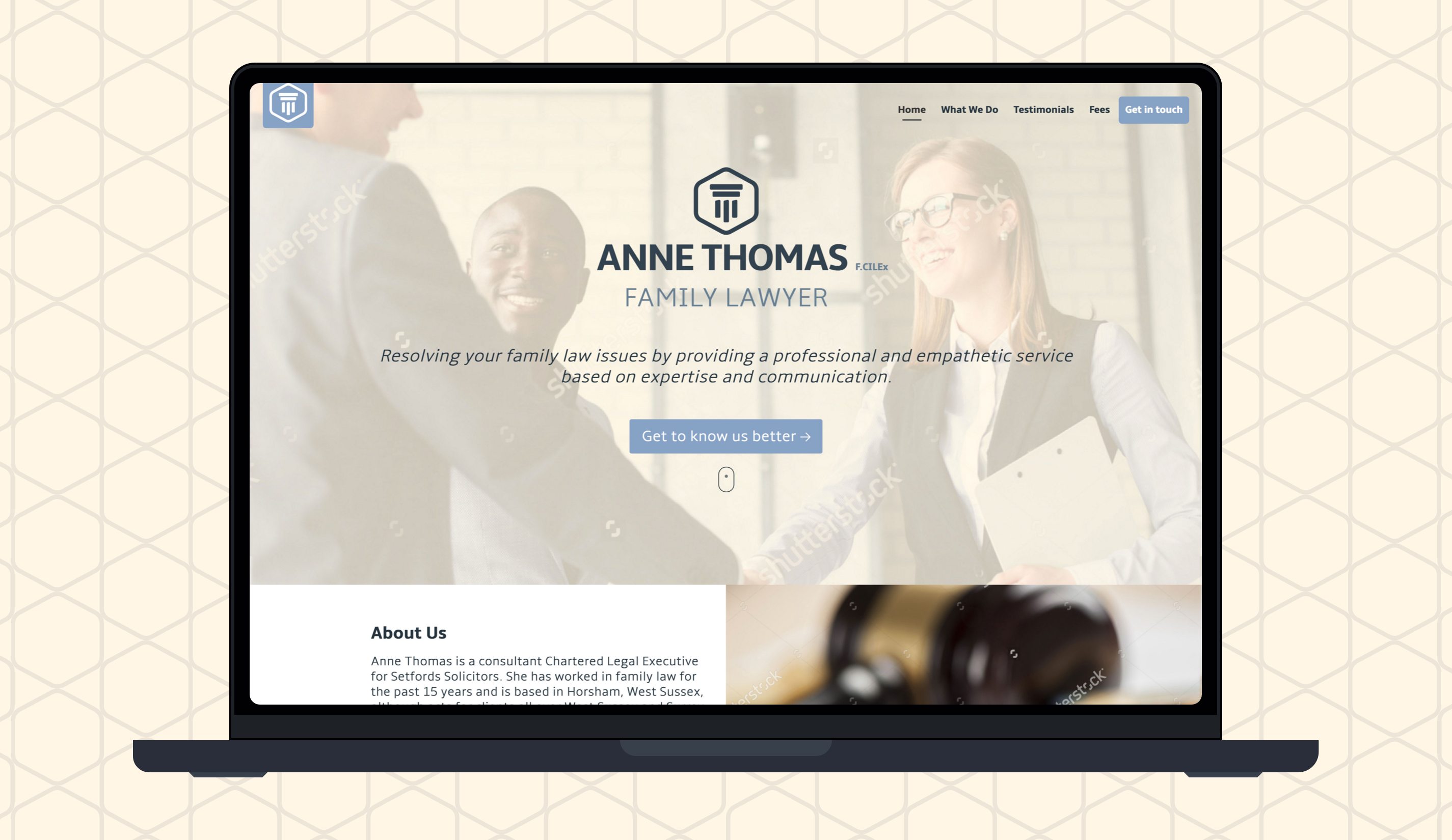
The final logo successfully captured the professionalism and reliability at the core of Anne Thomas’ practice. The pillar-inspired mark created a memorable visual identity that balanced elegance with strength.
While the website remained in concept stage, the project provided a strong and cohesive branding direction that could easily extend across future digital and print applications.
If you're looking for something similar, I offer branding and website design to help bring your ideas to life.