Kinnarps
An animation-led web experience designed to showcase content in a more engaging way.
- Industry: Furniture & Interior Design
- 2018
- My Role: Web Design & Front-End Development
- Photoshop · HTML · CSS · JavaScript
An animation-led web experience designed to showcase content in a more engaging way.
The Kinnarps project focused on creating a highly interactive single-page website that combined strong visuals with rich animation and motion design.
The challenge was balancing heavy interactivity with usability and performance. Almost every section included animated elements, transitions, or dynamic content, all designed to create a more engaging browsing experience without overwhelming the user.
The final result was a polished, technically ambitious website that brought energy and movement into the brand’s digital presence while maintaining a clean and structured user journey.
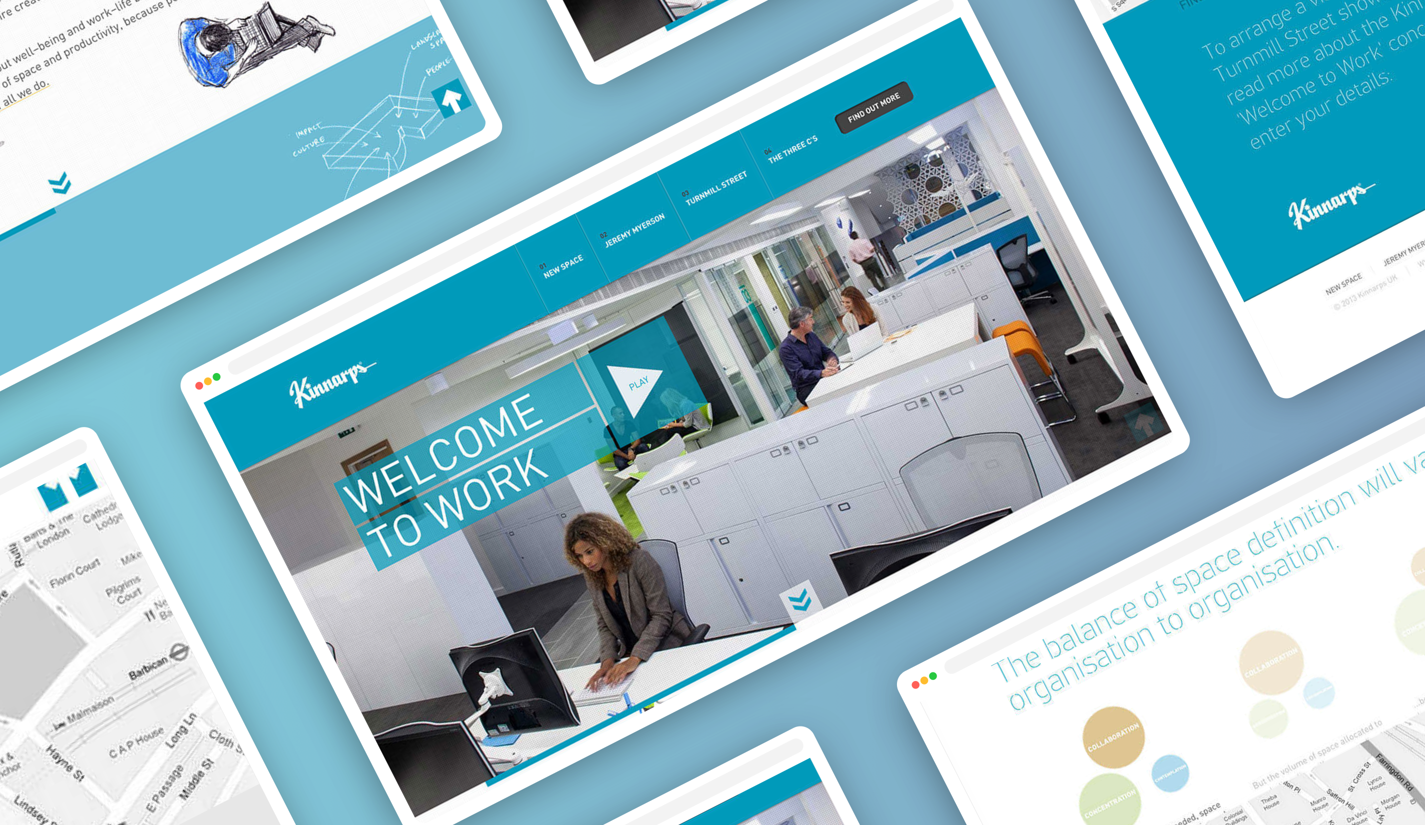
Animation became a core part of the visual identity for the project. Rather than relying solely on static layouts, movement and interaction were used to reinforce the modern, forward-thinking feel of the brand.
The clean layouts and structured spacing helped balance the more dynamic elements, ensuring the experience still felt professional and easy to navigate.
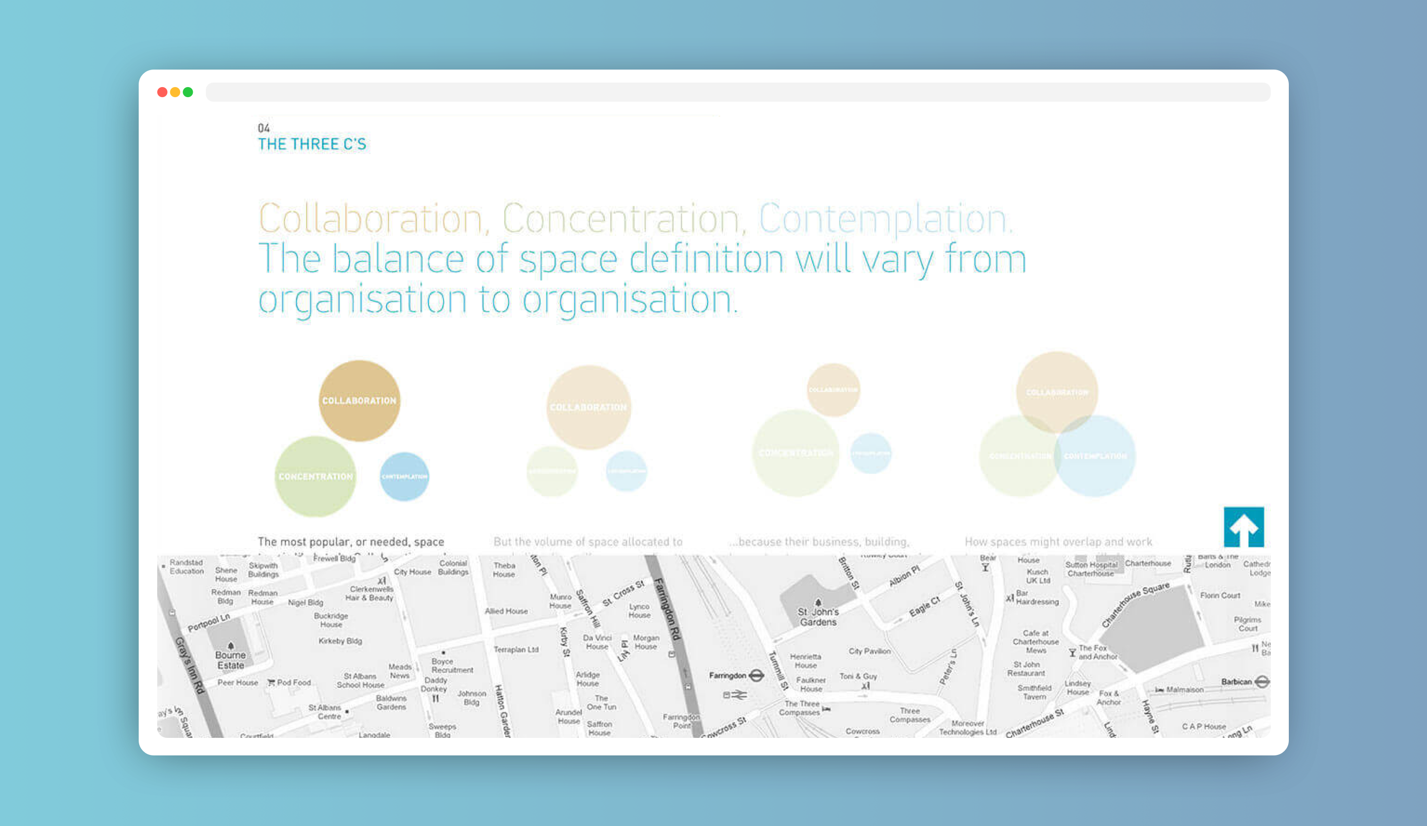
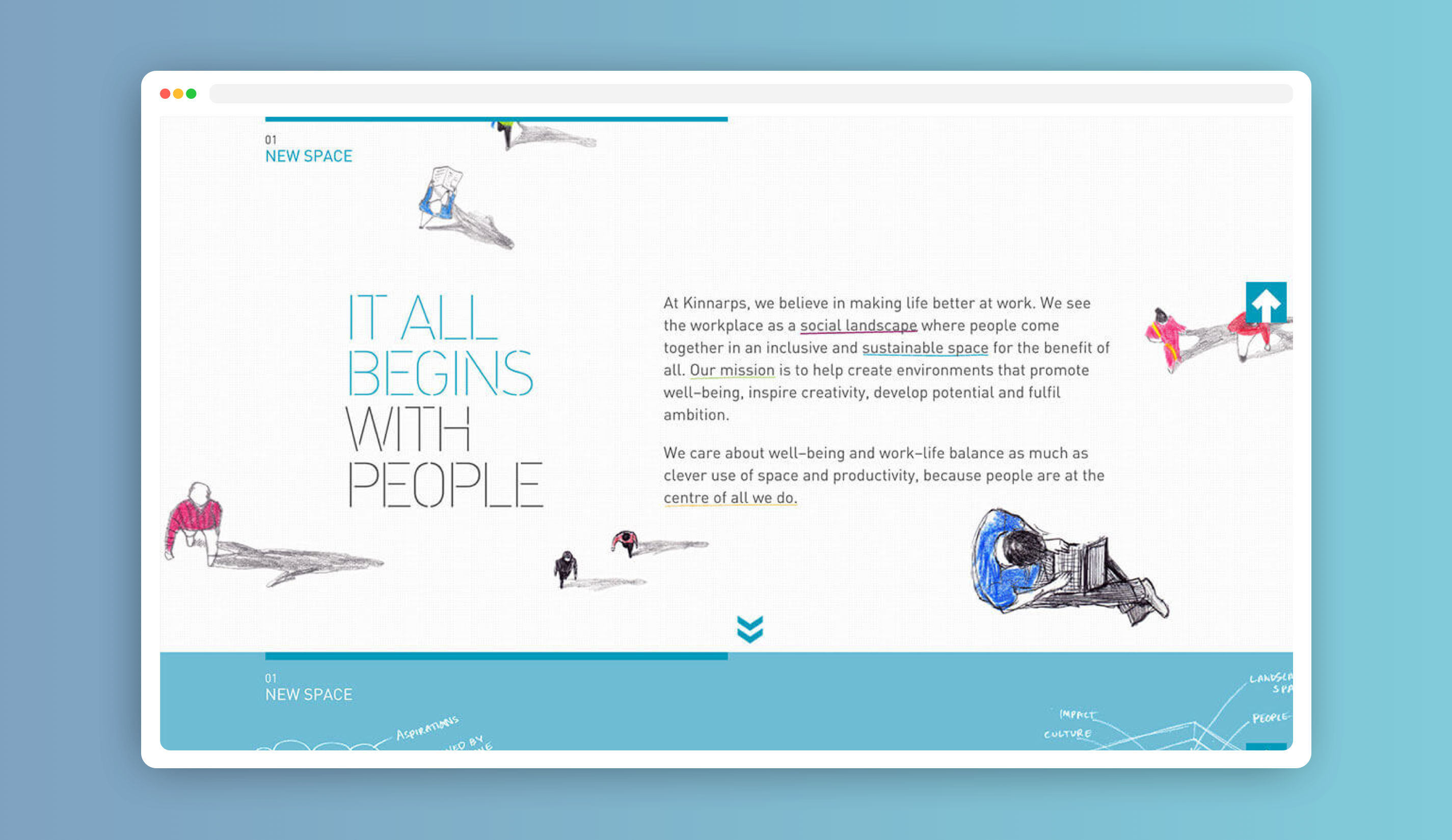
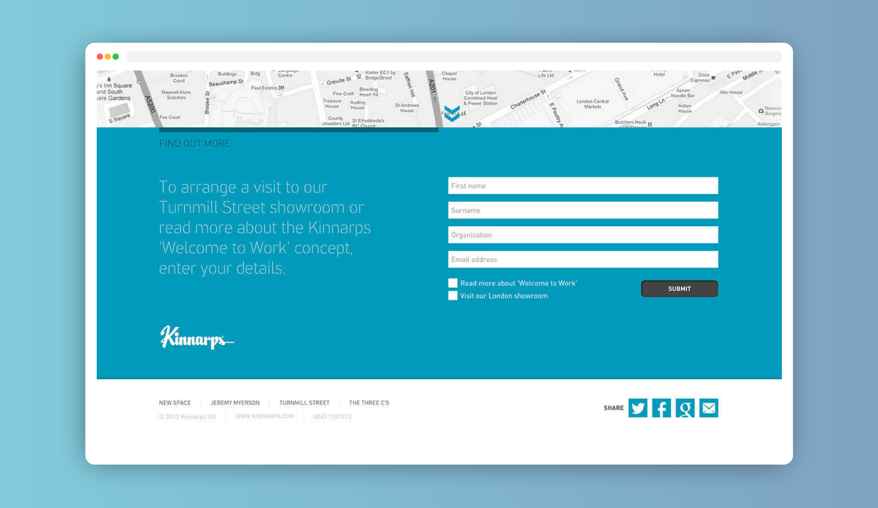
The site was built as a single-page experience, allowing users to move seamlessly through content without interruption. Carefully planned animations helped guide attention between sections while adding personality and visual depth throughout the journey.
A variety of slideshow styles were also introduced to support different types of content, from product showcases to testimonials and promotional messaging, helping each section feel visually distinct while remaining cohesive overall.
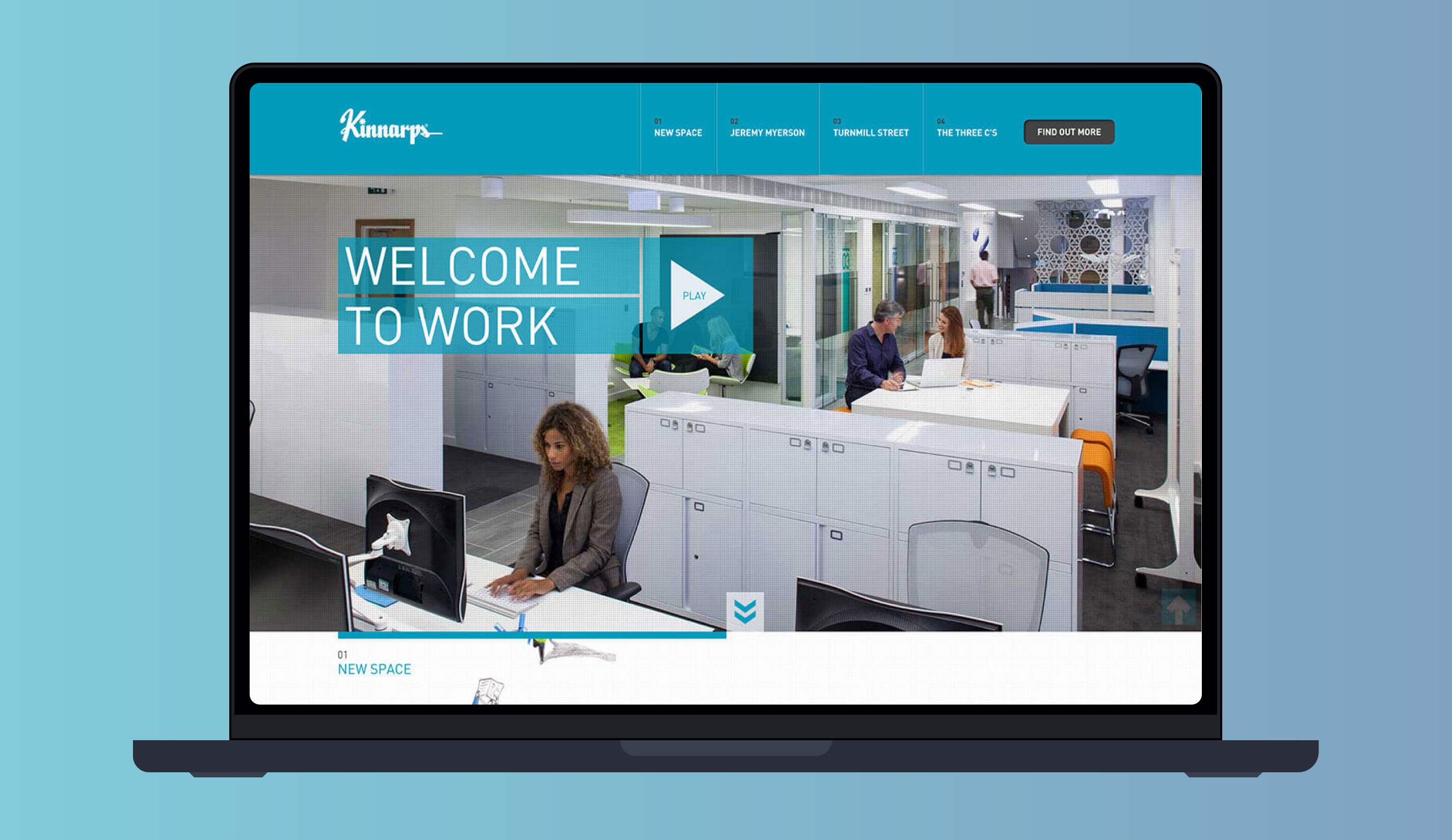
The Kinnarps project was a strong example of how animation and interaction can elevate a website when used thoughtfully. Despite the technical complexity, the final build remained smooth, responsive, and visually cohesive.
It was also a valuable opportunity to push creative front-end techniques further while learning how to balance motion design with usability and performance.
If you're looking for something similar, I offer branding and website design to help bring your ideas to life.