More Th>n
A clean insurance interface concept designed to simplify complex cover options and improve decision-making.
- Industry: Insurance / Financial Services
- 2021
- My Role: UI Design
- Sketch · Figma
A clean insurance interface concept designed to simplify complex cover options and improve decision-making.
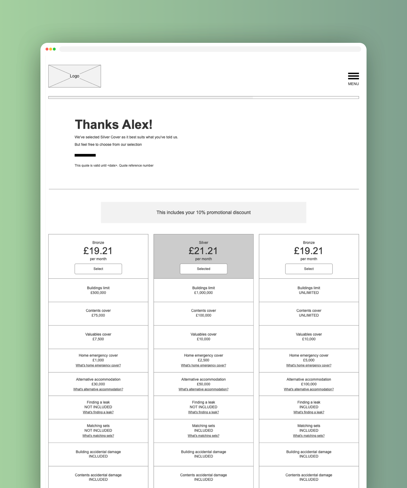
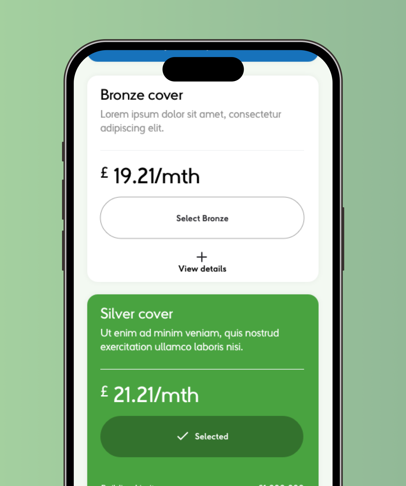
This project was completed as part of an interview design task for More Th>n. The brief focused on transforming a wireframe for a home insurance “Cover Options” page into a polished, user-friendly interface that aligned with the company’s brand identity.
The challenge was presenting detailed insurance information in a way that felt approachable, easy to compare, and visually clear. The concept focused heavily on structure, readability, and guiding users toward confident decision-making without overwhelming them.
Although the project was purely conceptual, it provided a strong opportunity to showcase problem-solving, UI thinking, and visual hierarchy within a real-world insurance context.
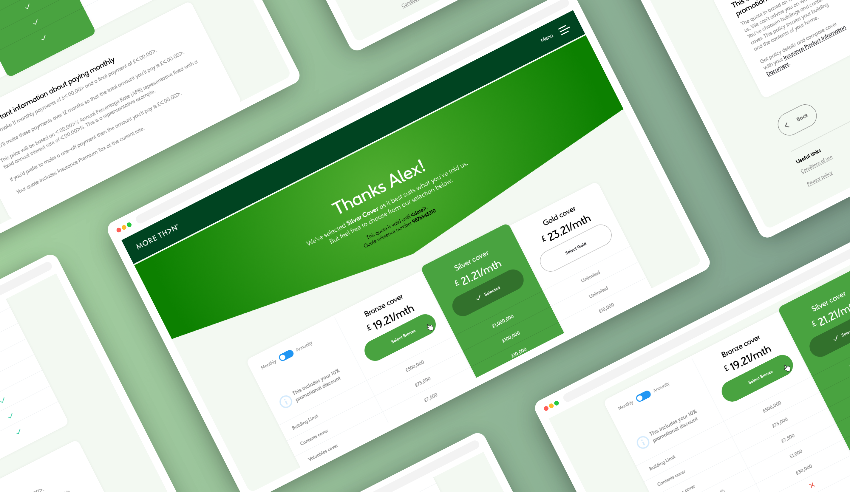
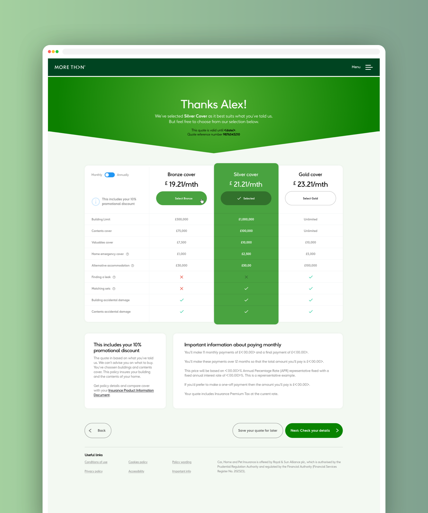
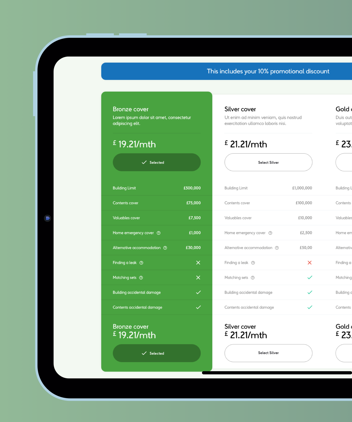
The interface was designed around making insurance plans easier to scan and understand. Clear visual hierarchy helped distinguish between Bronze, Silver, and Gold cover tiers, while the selected option was given additional emphasis to reinforce user choice.
A clean grid layout, simplified typography, and strategic use of colour helped reduce visual clutter while improving readability across the page. The comparison table was structured to allow users to quickly evaluate plan benefits without unnecessary complexity.
Special attention was also given to calls-to-action and supporting information, ensuring policy details remained accessible without distracting from the primary user journey.
Protègèm now presents a consistent and confident identity—from its logo and website to its marketing presence.
The result is a recognisable, engaging brand that supports growth, strengthens community connection, and reflects the energy of the dancers it represents.
If you're looking for something similar, I offer branding and website design to help bring your ideas to life.