ARC Plastering & Tiling
A bold trade-focused identity designed to reflect craftsmanship and professionalism.
- Industry: Construction / Trades
- 2017
- My Role: Branding · Logo Design
- Sketch · Photoshop
A bold trade-focused identity designed to reflect craftsmanship and professionalism.
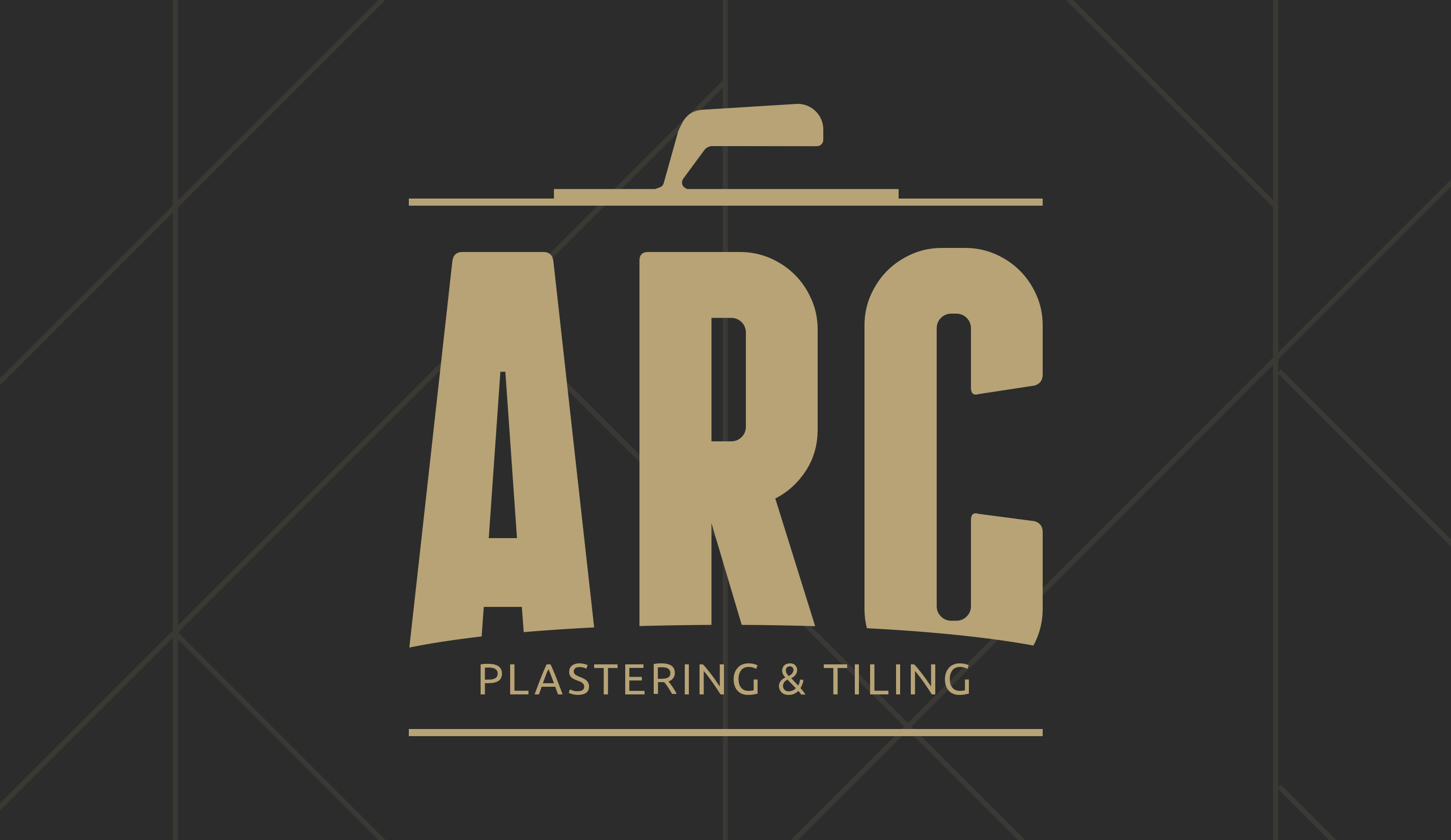
ARC Plastering & Tiling is a local trades business specialising in plastering and tiling services. The project focused on creating a refined logo identity that communicated quality workmanship and a strong professional presence.
The challenge was designing a mark that felt distinctive within the construction industry while still remaining clean, versatile, and easy to recognise across different applications.
The approach combined bold typography with subtle trade-inspired details to create a logo that reflected both craftsmanship and reliability.
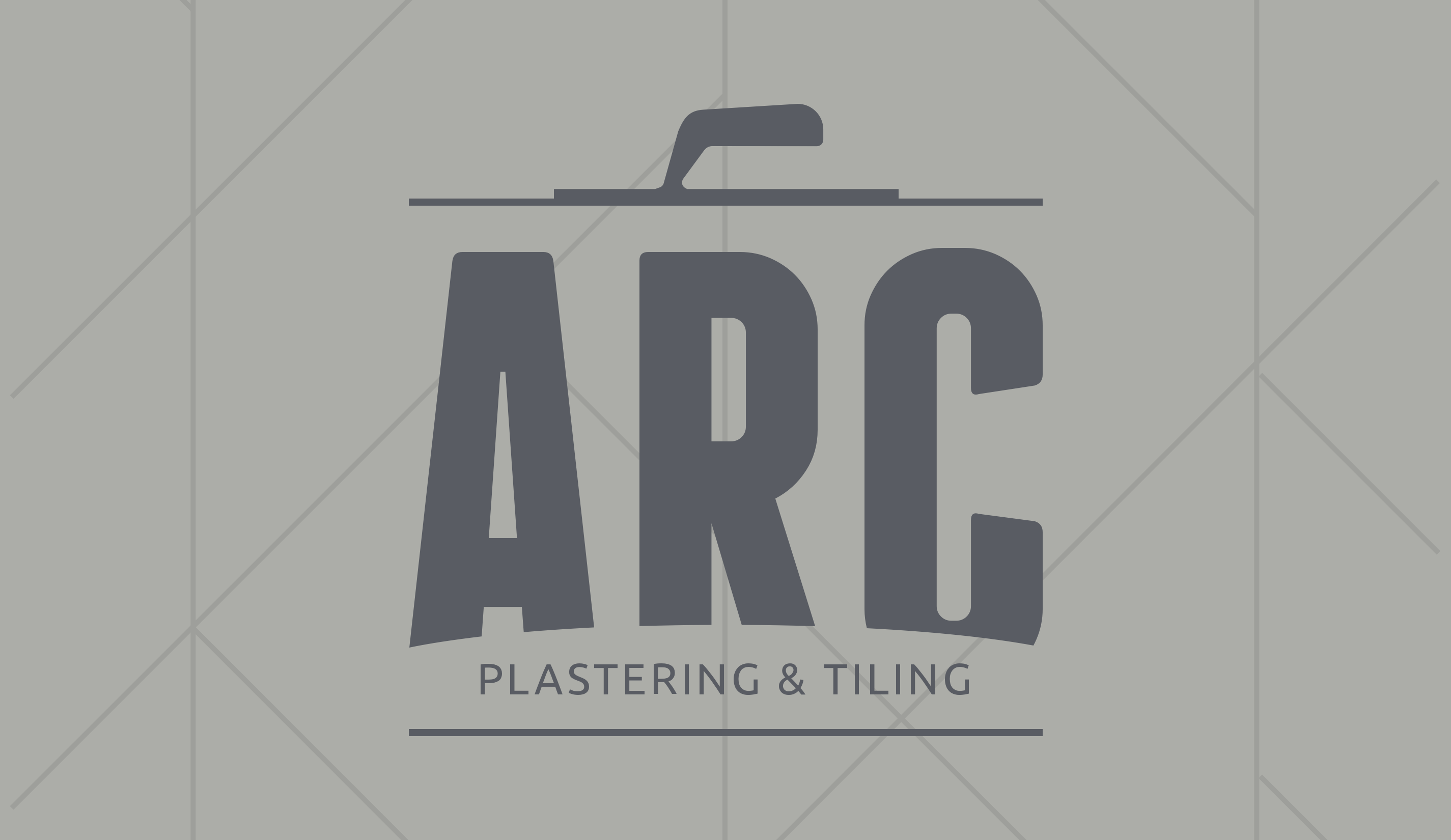
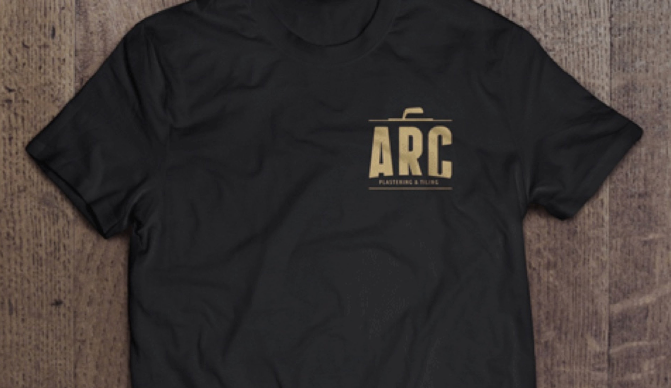
The final logo balanced strong typography with thoughtful detailing inspired by the plastering trade. A subtle reference to a plasterer’s hawk was integrated into the design, helping create a more unique and industry-relevant identity.
The curved base of the logo added a visual nod to the “ARC” name while reinforcing a sense of structure and flow throughout the mark.
The branding used a restrained gold-on-black colour palette to create a premium and professional appearance. This combination helped elevate the visual identity while maintaining the durability and confidence associated with skilled trade work.
Small design details and clean geometric structure gave the logo flexibility across signage, uniforms, vehicles, and digital applications.
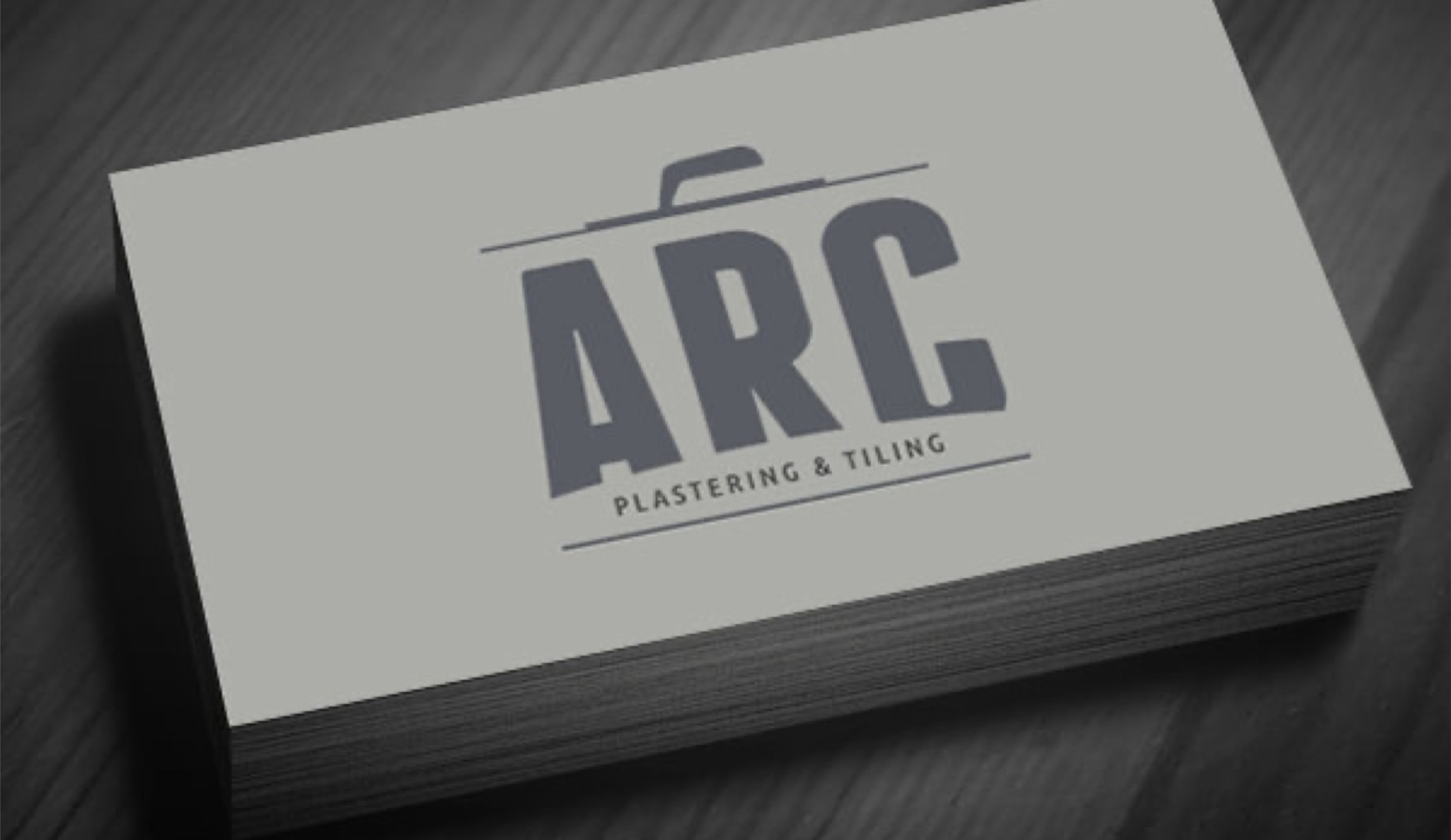
Although the project remained focused on logo development, the final identity successfully captured the professionalism and craftsmanship behind ARC Plastering & Tiling.
The result was a clean and memorable brand mark that feels both modern and grounded in the trade industry, providing a strong foundation for future brand growth.
If you're looking for something similar, I offer branding and website design to help bring your ideas to life.